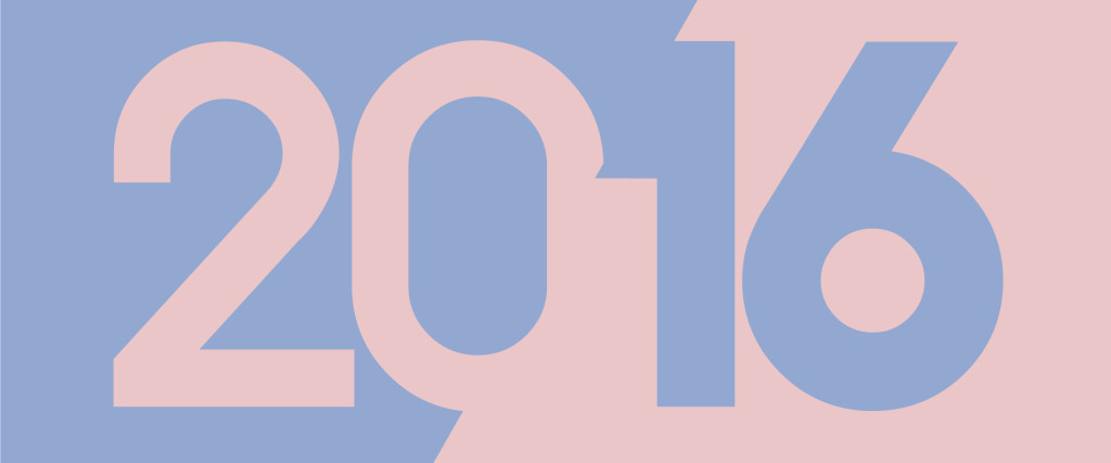
For the first time ever – a combination of two shades have been crowned PANTONE®’s colours of the year for 2016: Rose Quartz and Serenity.
Not only a balance of warm and cool, the collaboration of these colours is said to reflect society’s positive progression towards gender equality moving forward into 2016, where a generation of people feel less subjected to conforming to gender stereotypes – e.g in fashion – pink for girls and blue for boys.
Rose Quartz
PANTONE® describes Rose Quartz as a “persuasive yet gentle tone”…
Serenity
… Whilst Serenity is described as “weightless and airy”.
Our graphic designers are all well versed with selecting the right PANTONE® colours for the job, you can visit our graphic design page for further information on our design services.
*PANTONE® is the property of PANTONE inc and is a registered trademark.