
Website traffic has changed significantly over the past few years with the rapid growth of smartphone usage. This change means that users’ expectations of how a website should look and function on a mobile device has changed too.
Consider the following statistics:
- In 2018, smartphones accounted for over 52% of all online traffic with tablets at just over 12%
- 70% of all digital ad budgets in 2018 were spent on mobile
- Users spend on average 69% of their media time on smartphones
- Average smartphone conversion rates are up 64% compared to the average desktop conversion rates
Clearly what the stats show is that the way in which we access the internet is rapidly changing and having a website that looks great on all devices regardless of their shape or sizes, is now crucial to your online success. This is where Mobile Responsiveness comes in.
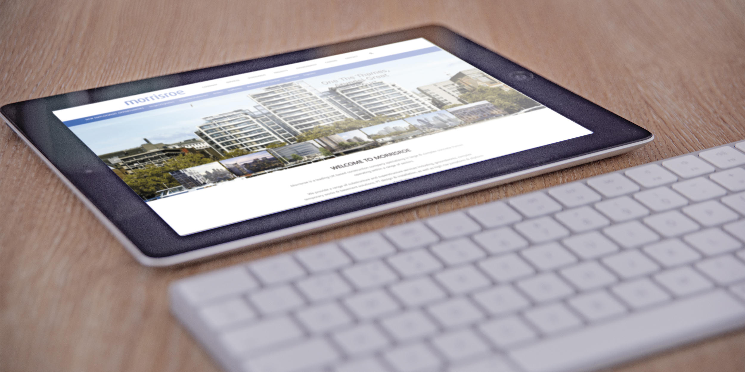
What is a responsive website?
Mobile Responsiveness is a design structure, enabling a website to automatically scale its content and elements to match the screen size of the device it is viewed on, therefore, eliminating the need to design multiple websites for different screen sizes. Now you can have one website that scales up or down, adapting itself to the device size whether that is a desktop, laptop, tablet or smartphone.
Mobile Responsiveness utilises a concept called ‘responsive design’ in which the look and functionality of your website is specifically designed and built for optimum user experience, regardless of the device size.
Benefits of a mobile friendly website
One of the major benefits of responsive design, is that it is designed based on screen size, not device. This means that, no matter what size screen someone is viewing your website on, it will display properly for that screen size.
Why is it important to have a responsive website?
The importance of Mobile Responsiveness goes much deeper than flexibility and aesthetics. As of July 2018, Google has implemented ‘Mobile-first indexing’ which means that Google will predominantly use the mobile version of a website’s content for indexing and ranking. Since Google drives 96% of mobile search traffic, having a website that adapts for mobile is now essential.
Consider these statistics:
- 80% of internet users own a smartphone
- Over 50% of smartphone users grab their smartphone immediately after waking up
- 83% of mobile users say that a seamless experience across all devices is very important
- Tablets account for the highest add-to-cart rates on eCommerce websites (nearly 9%)
We live in a multi-screen society where convenience, accessibility and flexibility are a top priority.
Due to this, it’s important for your site to be seamlessly viewable across as many devices as possible, because you never know what device someone will be using to view your website.

Why you should consider updating your website
Today’s user preference increases towards the use of mobile devices for internet searches compared to using a desktop. It’s quicker, it’s easier and it’s more convenient. If your website isn’t mobile responsive, or doesn’t meet the expectations of modern users, you’re missing a tremendous opportunity and quite possibly, a percentage of potential visitors.
Considering that 57% of users say they won’t recommend a business with a poorly designed mobile site and 61% of users are unlikely to return to a mobile site they had trouble accessing really stresses the commercial importance of a business in having a responsive website.
Updating your website to be responsive for mobile can also be cost-effective as you’ll only need to maintain one site, which can appeal to visitors on all devices and offers tremendous flexibility when you want to change your site’s content or tweak its design slightly as you’ll only need to do it once.
An often over looked feature is your website’s user experience. You want users to like your site, you want it to be easy to use and to convince them to return to your site. If someone visits your website on a mobile device, and it takes a while to load or your pictures don’t scale properly, it can make your company appear unprofessional.
Having a Mobile Responsive website is also much easier to manage. It enables you to make the changes yourself quickly and easily, without having to worry about how your new content will appear on different devices.
In conclusion, Mobile Responsiveness has become an important part of any modern web strategy and it should be part of yours too.
If you’re wondering where to start with all of this, get in touch and together, we can have a look at updating your website and make it Mobile Responsive.
References